


PPO Serve
PPO Serve is utilising an existing platform which is built for a completely different industry and adapted to try manage clinical services for maternal patients. Our task was to design a brand new platform from the ground up that will empower the users.
Role: UX Designer
Year: 2019
Company: Through Viga
The Challenge
Coming into this project one of the main problems to solve was that the users found it difficult to transition from paper to digital solutions because as they were using a platform from a different industry that was adapted to manage clinical services for maternal clients. The platform did not meet the users’ needs and created a lot of pain points. The goal was to create a new platform from scratch that will empower the users.
The Solution
I researched and identified problems through stakeholder talks, co-design sessions and user interviews. I created a working prototype from the wireframes and presented the wireframes and findings to stakeholders. We conducted user interviews by going to the hospitals and having a glimpse into how the nurses conducted their work and how they went about using the system on a daily basis. From these observations and findings, we were able to carry out our UX research and create a viable working product.
The Approach
I contributed to this project in terms of information architecture, problem-solving and wireframing. UI had not been applied yet. It was necessary to perform contextual interviews in order to understand how the users go about their daily tasks and which features they would need to use on a daily basis. By empathising with the users one is able to define the problems and, based on research done, make the best possible design decisions to alleviate users’ pain points. The platform is content heavy so it was important that the information architecture was prioritised and ensured that the platform was tested throughout the design process.


UX/UI Methodologies & Techniques:
Kick-off Meeting
Heuristic Evaluation
User Interviews
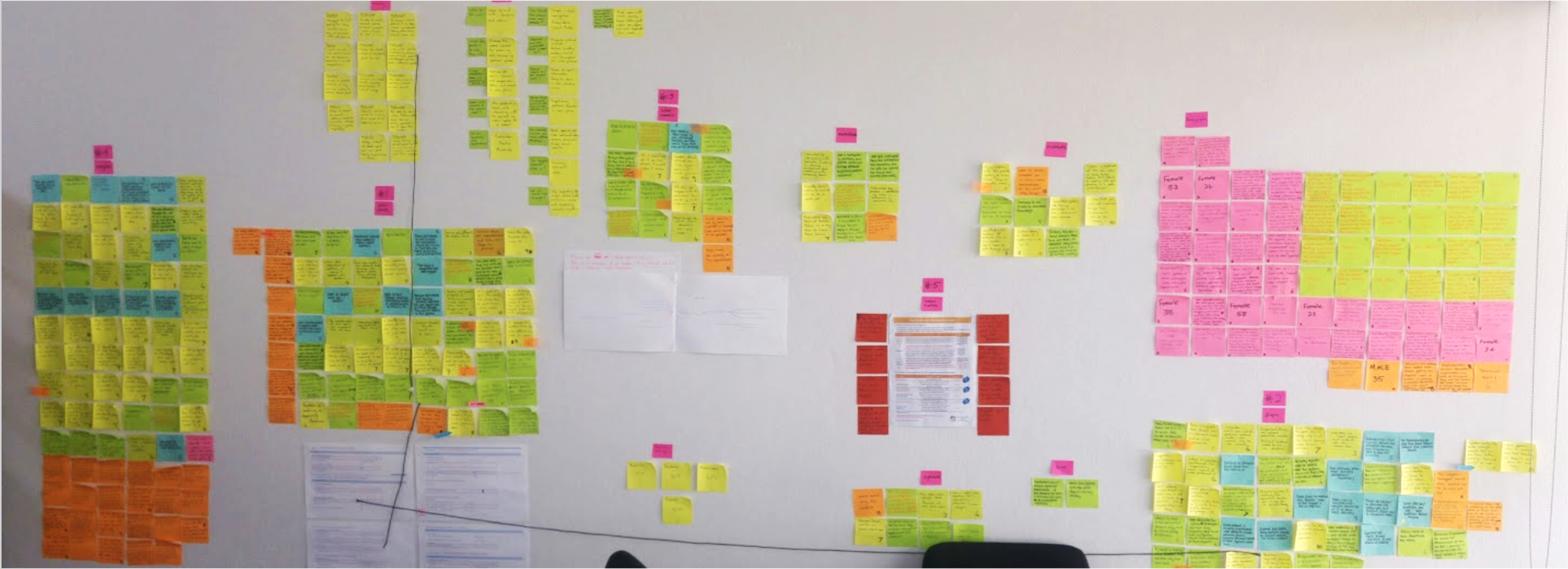
Affinity Diagramming
Personas
Information Architecture
Medium-fidelity Wireframes
Medium-fidelity Prototyping
Usability Analysis
Findings and Recommendations
Software used:


Heuristic evaluation
One of my main tasks in this project was to understand the insights from the research and translate it into wireframes. This included solving for the content heavy interface and understanding the information architecture in order to deliver a platform that is pleasing to use. I created a prototype that was used while testing.
Usability inspection method
I examine your site’s interface and compare it against accepted usability principles. The analysis results in a list of potential usability issues. It provide quick and relatively inexpensive feedback. I can obtain feedback early in the UX design process.
How is it conducted?
Site's/products scoring above 80% are doing an exceptional job of UX; those scoring between 50 to 80% have mixed UX (some good, some not good), and those scoring below 50% have generally very poor UX.
The overall score
OVERALL SCORE 44%
This score is below 50%. The heuristic evaluation shows you that they have to improve on their usability, utility, and desirability.
PPO’s over all score

Scenario - A day in a doctor’s life
We use Scenarios to fully understand, the user’s needs, and motivations. Helps us to create: Empathy. Empathy helps us to understand not only our users’ immediate frustrations, but also their hopes, fears, abilities, limitations, reasoning, and goals.


Co-design session
Now that we found the issues, we could identify the key main problems the platform was having. After this step we took the stakeholder through the problems and proposed we have a co-design session. This co-design session included all stakeholders to focus our efforts and identify opportunities for a more usable design solution.
We used one of the problem statements and created a solution for that specific screen. This creates a higher degree of originality and user value. Improved knowledge of customer or user needs. Immediate validation of ideas or concepts.
We all sketched on paper the solution to the problem, we presented our sketches to everyone, and the features we all thought were valuable and ideal for the problem got a star on them.
Content heavy
Doing the co-design session gave me great insights on what to focus on when doing the wireframes. I worked closely with multiple stakeholders and users to ideate and design together, with a lot of interviews, co-design engagement and testing throughout the design process.
Their previous platform was to content heavy and the user's faced many problems. The users ranged from being tech savvy to not tech savvy at all.
I needed to design the information architecture in such a way that would improve the usability. In addition to this I decluttered the UI by organising components according to importance to the users. We established this by interviewing and observing the users of the system.


The design phase
We focused on this project in phases. The next phase was to focus on uplifting the wireframes into high-fidelity. Here is a concept of how I would create the UI. It needed to be easy on the eye.
I build digital experiences and interface designs
With over four years of experience in digital design, I have worked with companies and startups to design and develop both large and small-scale web and app projects.
Interested?
Let’s get in touch!
You can stay in touch with me via Email, Linkedin or Instagram.